 Keywords: Excel, box-plot,box plot, median, whiskers, percentile chart.
Version: Excel 97 or later
Dowload:
Due to the popularity of the Box-plot and whiskers chart in Excel article published some time ago I decided to revise the article with a new, improved way of creating box-plot charts containing more information. The approac is slightly different as you will see in the following step by step instruction.
The drawback of the previous, very simple, box-plot described here was the lack of a median marker. There are several ways to achieve median markers, one of which will be described here.
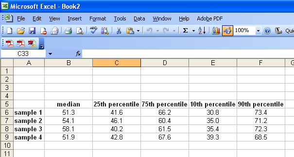
1. Start by creating a series of data containing median, 25th percentile, 75th percentile, 10th percentile and 90th percentile data.
The plot will consist of a Stacked column diagram with three segments plus two errorbars. Since the Stacked column diagram is cumulative we need to segment our data into five series as follows:
2. Create another table with five data series like in the picture below. The first data series will be the bottom (and later invisible) segment and is equal to the 25th percentile data series.
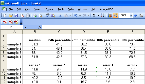
3. The next data series is the segment difference between the 25th percentile and the median (=B3-C3 and fill down in the example).
4. The third segment and next data series will be the difference between the 75th percentile and the median (=D3-B3 and fill down in the example).
5. The 10th percentile and 90th percentile data series are constructed in a analogous fashion; the 10th percentile whisker data is the 25th minus the 10th percentile =C3-E3 (and fill down).
6. The 90th percentile whisker data is the 90th minus the 75th percentile =F3-D3 (and fill down).
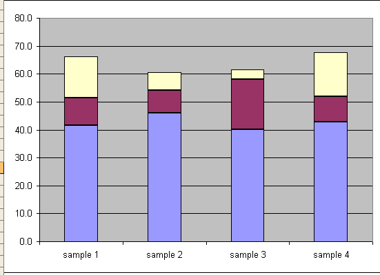
7. Select range A9:D12 and create a Stacked Column chart using the chart wizard. You will the have something similar to the chart below.
8. Add the 10th percentile whiskers by selecting the bottom segment, right click –> Format Data Series –> Y Error Bars –> Custom Minus (-) –> select range E9:E12.
9. Add the 90th percentile whiskers by selecting the top segment, right click –> Format Data Series –> Y Error Bars –> Custom Plus (+) –> select range F9:F12.
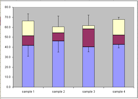
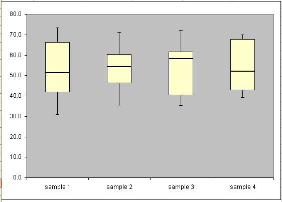
10. Select the bottom segment, right click and select Format Data Series, select Border –> none and Area –> none in the Patterns tab. The bottom segment is now invisible. After some cleaning up and simple formatting of the chart you should have something similar to the picture below.
Download example: improved-box-plots.xls
Happy charting!
Popularity: 8% [?]
Thank you very much.
this helped me a hugely. =D
I have the same question about outliers. Any way to plot those?
help
I really enjoyed reading your article, keep on writing such exciting posts!
hi,
first of all kind regards for your boxplot.
i have only a question left. is it possible to display max and min values of your data as a dot or a cross above/below the 10%/90% percentile
best wishes jonas!
Can you do a horizontal one?
How would you plot outliers?
Anyone know anything about indicating outliers?