Download: QC chart for Excel 2007 / 2003 (downloaded 3523 times)
A couple of years ago I created a very simple QC-chart to keep track if instrument performance over periods of time. The chart fetches the usual data from user input and calculates average, upper and lower control and warning limits, and plots these data into an Individuals chart and a Moving average chart.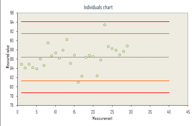
Once you have established the acceptable performance of your instrument/method, this makes it very easy to see if your method is performing poorly.
The baseline performance is usually established by collecting data over an extended time period, say one month, using some form of stable reference testing material. In the case of chemical analysis this can be a certified reference material (CRM) consisting of for example metal ions of a known concentration in a stable sample matrix.

Download: QC chart for Excel 2007 / 2003 (downloaded 3523 times)
Popularity: 12% [?]
thank you soooo much, this really helps!
I liked the website a lot and it’s very informative. Just couldn’t understand the logic behind
central line Stdev*1.13
Warning line Stdev*2.83
Control line Stdev*3.69
Could you please help?
Thanks alot, it is really helpfull