Keywords: Excel, bar-chart, secondary axis, differing data sets, non-overlapping bar chart.
Version: Excel 97 or later
Sometimes you might want to display two data series that differ greatly in value in the same bar chart. If you use the default bar chart option in Excel you might then get something like in picture 1 below.
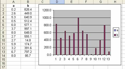
Picture 1.
This is of course undesirable since the data in series a isn’t even visible in the chart. Fortunately in Excel one is able to display data on a secondary y axis. Just select data series b, and right click. Select Format Data Series, the Axis tab and select Plot series on à Secondary axis (picture 2).
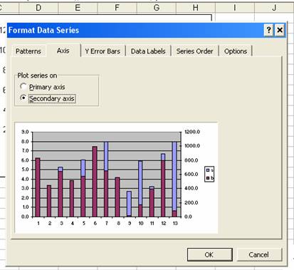
Picture 2.
Now data series a is associated with the primary and series b with the secondary axis. The problem is that the bars in the chart is overlapping and partially obscuring each other. This can be fixed by using a work-around according to the following steps:
1. Select the cell range containing both of your data series (A1:B14 in our example) and drag and drop onto the chart. You will see something similar as in picture 3. What we have done is basically adding two dummy data series to the chart. You will soon see why.

Picture 3.
2. Now, select any visible data series and cycle to “dummy” series b using the up arrow. Select Format à Selected data series à Axis tab à Plot series on à Secondary axis. You will now see something similar to picture 4.

Picture 4.
3. Ok, we now have a chart with double data series, what now? Select the first series (green arrow in picture 4) and right click. Select Format data series and in the Patterns tab select Border à none and Area à none. Select the second dummy series (red arrow in picture 4) and repeat the procedure to hide the bars (see picure 5).

Picture 5.
4. You should now have something similar to picture 6 where the data is plotted on two axis and adjacent to each other instead of overlapping. Good luck!

Picture 6.
This article was published on bloggpro.com.
Popularity: 4% [?]